I'm sorry, but those covers are awful. They are too minimalist in design for such a rich work. They seem to be compensating for the design by clustering a confused muddle of an illustration (which seems to crib elements from other editions as well as from the movie). I would not buy these editions based on these covers.
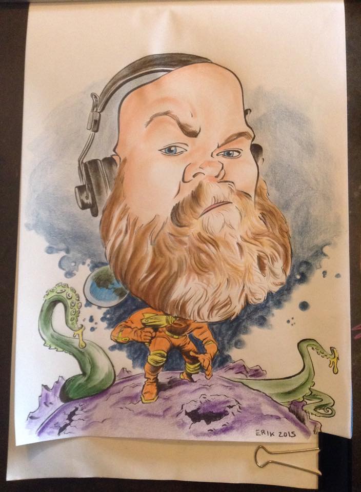
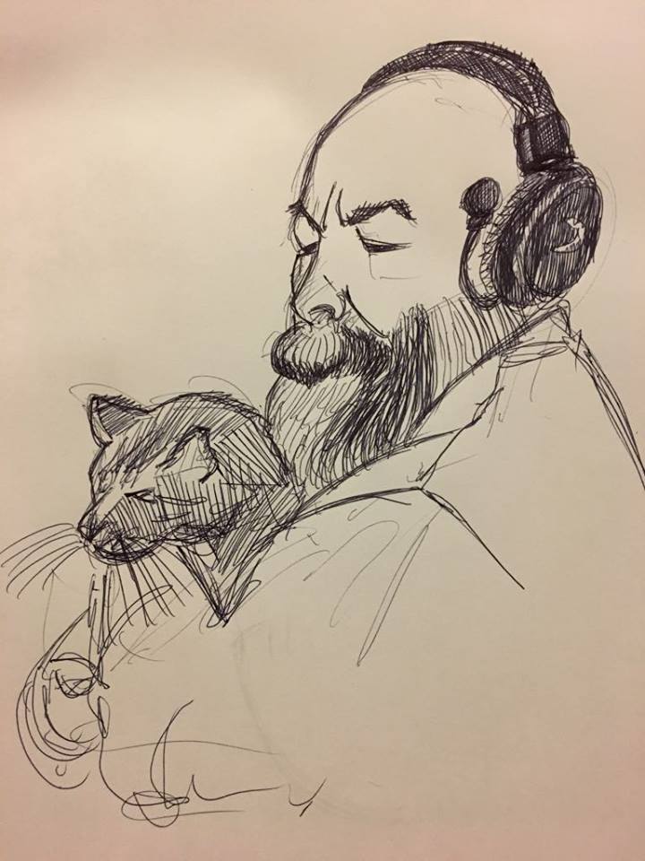
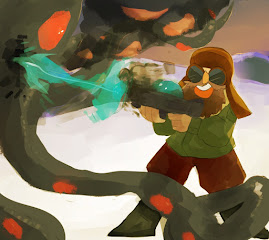
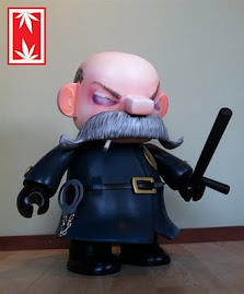
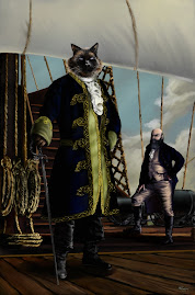
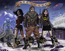
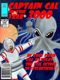
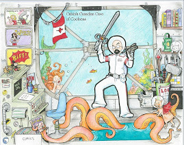
I forever stand vigilant to protect this planet from the myriad of forces that are always against us. Be it the octopus, zombies, aliens or the robots my team of human agents, and our feline allies, circle the globe in a never ending struggle for human freedom.
I learn all I can on every subject that interests me. I especially enjoy ancient history because in the past there are valuable lessons to be found. Also, if I ever get my time machine to work properly, it would be good to know a bit about possible destinations and what to expect when I get there.
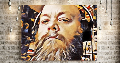
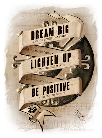
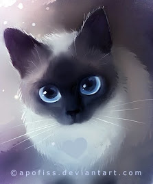
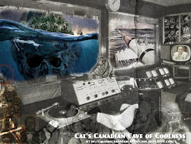
I greatly appreciate beautiful design. Be it manufactured or found naturally I am fascinated by the process of invention. I am attracted to the unique, the strange, the haunted. I like to share what I find on this blog.
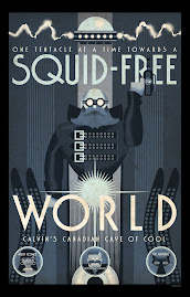
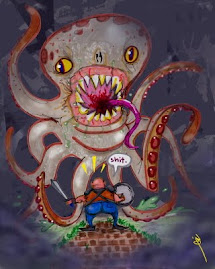
And not let us forget the 'Cephalopod Menace' who, if allowed to, would wrap their tentacles around all that is good and pure in this life and crush it until it remained no more. They are creatures of pure spite. Hate is all they know. Death is all they do. They are our most ruthless and determined enemy.
So we fight. Selena has the celebrity contacts, the cat is ruthless and without pity, Roosevelt's ghost has the experience and I do the wetwork.
Fighting for the future of the planet doesn't have to be a chore, however. We can take the time to appreciate all that is cool in this world even as we cut the octopus into bite sized chunks.
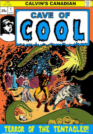
This is the reason there has always been and must forever be, a Cave of Cool. Be sure to wipe your feet before you enter.


%20(002).jpg)


sdtb.jpg)


5 comments:
I have some older paperback copies of the series and my covers aren't nearly that cool.
I'm sorry, but those covers are awful. They are too minimalist in design for such a rich work. They seem to be compensating for the design by clustering a confused muddle of an illustration (which seems to crib elements from other editions as well as from the movie). I would not buy these editions based on these covers.
Glad to have sparked a reaction. I feel nostalgia for these. They were on the compies we had in our library.
I like how the "o" in "Tolkien" is a Ring.
Your blog is very informative. WLCI school of advertising and graphic designing offers programmes & courses for graduates and undergraduates students.
Advertising Institute
Institute of Graphic Design
Post a Comment